There’s a lot of reasons to love Neon White. It’s a game confident in its ambitions, singularly focused on delivering small slices of exhilarating, speedrun-centric action gameplay. In a year that’s already seen a slew of strong releases, Neon White has already staked an honorable claim in many Game Of The Year lists with a consistently strong moment-to-moment gameplay loop combined with an impressive set of aesthetic choices.
For all of the (many) things that it gets right that have been elaborated upon in the our Neon White review, there are just as many details that have gone overlooked in its appraisal. In a game as energetic and engaging as Neon White, it can be easy to miss some of the finer details to go into constructing the experience, because you’re often too busy focusing on nailing that platinum run.
The particular element of Neon White that inspires me the most, however, has a lot less to do with how it feels to play (which is still pretty fantastic) and a lot more to do with the nuts and bolts of its visual design. Although many of Neon White’s character designs and even its visual interpretations of heaven are refreshing to behold, it’s the way in which the game communicates information to the player through its user interface and graphic design that might be chief amongst its visual accomplishments.
Neon White's Stylish HUD
As you speed through Neon White’s polygonal renderings of afterlife, you’ll be instinctively training your eyeballs to trace a path backwards and forwards between the center and the bottom corners of the screen. Ahead of you is the path you need to conquer, and in the corners are your Soul Cards, your health, your ammo: the tools that you will use to create the path. Neon White moves quickly, and thankfully, the information you need is dispersed to you quickly through the game’s HUD design.

The Soul Cards themselves, which represent your vital selection of weapons and their abilities, are a masterclass in such efficient design. The black weapon silhouette in the center of the card gives a clear impression of the type of weapon being used, whilst the faded markings behind it subtly indicate the way in which that weapon attacks.
For example, the default katana weapon used by the titular protagonist has a clear silhouette of the sword, but behind this silhouette is a faded crescent pattern, indicating the slashing arc that the weapon utilizes in gameplay. Contrast this with the pistol, which has two pointed angles behind to indicate both its faster rate or alternatively, the multiple jumps that can be performed by using its secondary ability, and suddenly you begin to realize the level of detail being presented to the player through the elegant designs of these cards.
Beyond the graphics on the cards, it’s their use of color that truly elevates them from mere HUD assets to flashes of design brilliance. Much like the environments of Neon White that juxtapose large swathes of white with small blotches of ultra-saturated color on pieces of scenery to indicate your path forward, the soul cards use this juxtaposition of color to quickly illuminate a weapon’s remaining utility to the player.
As you use a weapon, the color quickly drains from its background in a way that is both satisfying and consistent with the game’s use of color elsewhere. Take a quick glance at your card, and the ratio of white to color will quickly show you have much "use" it has left, without you having to acknowledge any kind of number. It’s a creative method of showcasing such a basic bit of data that ultimately helps contribute to a sense of the game’s overall aesthetic, which repeatedly pushes white against colour merely as a stylistic flourish, but also as a means of conveying information to the player.
Neon White's Aesthetic Flourishes
The same praise of "stylishly but effectively" communicating information can also apply to the designs in the left corner of the screen, which showcases not only your health using some iconic (and decidedly neon) hearts, but also a portrait of your protagonist, Neon White, that moves in time with your movements.
At first, I wasn’t able to discern if there was any particular purpose to this portrait, but as I continued to play, I determined that although it was a little less practical than some of the HUD’s other elements, it did serve to ground the fast-paced movement of the game and tie it to the character you’re guiding. As a game that doesn’t show the arms or hands from its first person perspective, I was surprised by how much I appreciated this portrait as a kind of visual reminder of what’s actually happening.
As you speed through the levels, the portrait sways back and forth hypnotically. If you grind to halt, so too does the portrait. It’s the sort of neat thing that isn’t completely necessary but certainly has some minor gameplay merit, existing almost at the exact midpoint between function and aesthetic.

Just behind the character, there’s also a string of text thrown in for aesthetic purposes, looking as though it’s been plucked straight from Cowboy Bebop’s iconic opening sequence and slapped into the corner of the screen. It’s an odd choice, and not a particularly functional one, but once again, it’s another way of conveying a vibe, which is something Neon White is incredibly good at.
Indeed, Neon White is so good at evoking a vibe that if it did anything more, it would probably be doing too much. Yet the game often shows careful planning and restraint in its art direction and especially its graphic design. Even beyond the HUD, the graphics in the game’s menus and end-of-level screens are clear, concise, and consistent. I’m a huge fan of how as your neon rank increases, a burst of neon color briefly ignites behind the monochrome number. It’s one of many ways that the game reminds you of its identity through a brief but creative animation.
Style & Substance
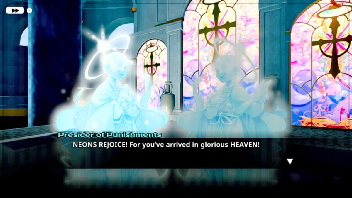
Across all of these design decisions, Neon White regularly invokes contrasts: the divine and the unholy (in the designs of the heavenly creatures and the opposing "demonic" masks of the Neons), the ancient and the modern (in the architecture of the locations, which blend the two together), and of course color and tone (in the contrast between monochrome and bright color) are all pushed against each other in the game’s design. Amidst what can occasionally feel like a chaotic symphony of visual ideas, Neon White ultimately keeps the presentation of its most essential information impressively balanced: not too obscured by the accents and flourishes, and not so mundane as to detract from the game’s powerful art direction.

In the same way that the speedrunning action gameplay shows clear focus with solid controls, a flexible set of mechanics and level design that places emphasis on bettering your own time, the game’s visual design shows the same level of focus through this intricate balancing act of style and substance, something which cascades into every detail of the game.
You could never mistake Neon White for any other game, but it achieves this uniqueness without sacrificing any of the necessary function of its visuals. In this way, Neon White’s HUD and many of its surrounding graphical elements provide a compelling blueprint for how to approach UI design in a modern action game: if you’re seeking some divine inspiration for your next action game project, look no further than Neon White.
Have a tip, or want to point out something we missed? Leave a Comment or e-mail us at tips@techraptor.net


